A custom stamp only works if the impression is clean, repeatable, and easy to read on the first press. In practice, that comes down to three things: the material, the surface quality of the stamp face, and how you turn the artwork into a shallow relief. I’ll walk through the decisions that matter most, the settings that save you from wasted prints, and the trade-offs between flexible filament and resin so you can choose a workflow that actually performs.
The fastest route to a reliable custom stamp
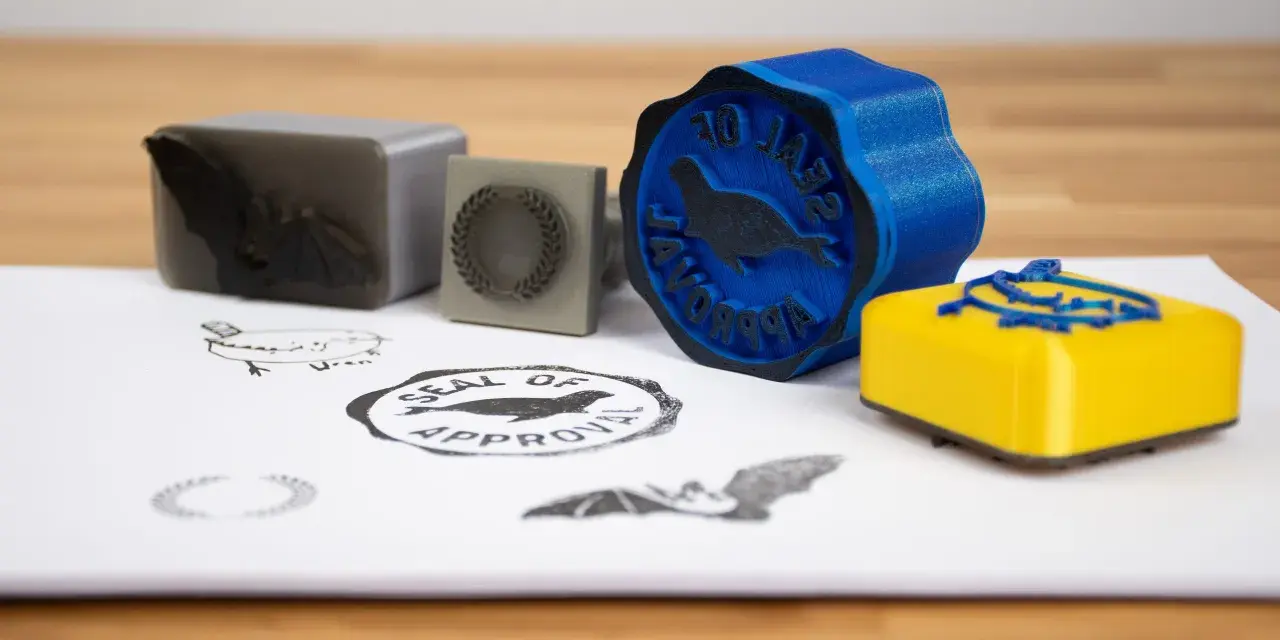
- Flexible resin gives the sharpest detail for small ink stamps, while TPU and other flexible filaments are better when you want a cheaper, cleaner FFF workflow.
- PLA is usually too hard for the stamp face in ink applications; it tends to leave weak or blank areas instead of a full impression.
- Mirror the artwork before printing, and keep the raised design only a few millimeters deep.
- For FFF printing, I prefer a smooth build surface, a thin glue-stick layer, and about 60% infill for larger flexible stamps.
- For clay or soft embossing work, a rigid stamp can be acceptable because the workpiece provides the give, not the stamp itself.
What makes a stamp impression work well
I think of stamp design as a surface-quality problem, not just a modeling problem. A good stamp face has to be flat enough to contact the paper evenly, soft enough to transfer ink without crushing detail, and shallow enough that the raised geometry remains legible after repeated presses. The ideal surface is not always mirror-smooth either; a little bit of texture can help hold ink instead of letting it bead and smear.
That is why the same design can behave very differently depending on whether you are stamping paper, clay, soap, or another deformable material. For paper, compliance matters most. For clay, the material you press into provides much of the flexibility, so the stamp itself can be more rigid without ruining the result. That difference is what drives the printer and material choice, and it is where most first-time projects go off track.
Choosing the right printer and material
If I want the cleanest detail, I reach for resin printing. If I want lower cost, less mess, and an easier workflow on a standard desktop FFF machine, I move toward TPU or another flexible filament. The sweet spot depends on what the stamp is for and how fine the artwork is.| Option | Best for | What I like | Trade-off |
|---|---|---|---|
| MSLA with flexible resin | Tiny text, logos, fine line art, crisp ink stamps | Very high detail, smooth face, minimal finishing | Higher material cost, more cleanup, resin leftovers are less convenient |
| FFF with TPU or other flexible filament | Larger stamps, hobby use, frequent iteration | Cheaper workflow, cleaner shop process, long shelf life for filament | Less detail than resin, more sensitivity to surface flaws and print settings |
| Rigid PLA or PETG | Clay embossing blocks, simple test tools, non-ink applications | Easy to print and dimensionally stable | Usually too hard for a clean ink-transfer face |
For flexible filaments, I usually think in terms of Shore hardness. TPU typically sits around 60A to 90A, and the softer end transfers better but is also more difficult to print cleanly. That trade-off matters more than brand names or marketing language. A slightly softer face usually gives a cleaner stamp, but if it gets so soft that the edges wobble, the impression gets muddy instead of sharp.
My practical rule is simple: if the artwork is tiny, detailed, or meant for presentation-quality paper work, resin is worth the extra effort. If the stamp is larger, more forgiving, or part of a quick prototype cycle, TPU on an FFF printer is often the better engineering decision. From there, the next step is shaping the model so the geometry helps the print instead of fighting it.
How I model the stamp so the artwork survives printing
A stamp is basically a reversed relief, which means the model has to do a little more than look right in CAD. I start with vector artwork whenever I can, because clean edges translate much better than a low-resolution bitmap. Then I build the raised detail into a solid body and keep the emboss depth shallow enough to stay crisp under pressure.
- Use vector art or a clean SVG whenever possible.
- Mirror the text and any directional graphics before export or slicing.
- Keep the raised design to a few millimeters deep; 2 to 3 mm is usually enough for small stamps.
- Avoid sharp 90-degree undersides on the relief if you are using flexible filament.
- Add small chamfers where practical so the print does not rely on perfect bridging.
I also design the body with stability in mind. A thin stamp face may look elegant, but it flexes too much and makes pressure inconsistent. If the stamp is meant for a handle, I give the back enough meat for a secure bond. If it is meant to be pressed by hand, I make sure the grip geometry spreads force evenly so the center and the edges hit at the same time.
Text deserves special care. Even a good font can disappear if the strokes are too delicate or too close together, especially on a flexible face. I would rather simplify a logo slightly than print something beautiful in CAD that turns muddy on paper. Once the model is solid, the next risk is the print setup itself, and that is where many decent designs still fail.
Print settings that make or break the impression
For FFF printing, the build surface matters more than most people expect. I prefer a smooth sheet for stamp faces because it gives the cleanest contact surface. A satin sheet can work, but it often leaves a slightly weathered look. A textured sheet is the wrong choice for this job because the pattern transfers straight into the stamp face.
On flexible filament, I print the image side down so the contact face is as flat and polished as possible. I also use a very thin and even glue-stick layer to tame adhesion on smooth or satin sheets. If the glue layer is lumpy, the stamp will faithfully reproduce those bumps, which defeats the whole point. For larger stamps, I usually aim for around 60% infill or higher so the face does not collapse when pressure goes on.
- For FFF: face down, smooth sheet, thin glue-stick layer, high infill, and dry filament.
- For flexible filament: expect stringing if the filament has absorbed moisture, and dry it before printing if needed.
- For MSLA: orient the image away from the build plate and avoid supports or pads unless the geometry absolutely needs them.
- Avoid relying on ironing: it may look better in the slicer, but the ironed pattern can still show up in the impression.
I also avoid supports on flexible stamp faces whenever I can. They are difficult to remove cleanly, and the cleanup often damages the edge detail more than it helps. If I need support-like structure, I would rather redesign the relief or use a staged print strategy than spend time picking away at the face with a knife. Once the print is off the machine, the last stage is finishing and testing, and that is where small adjustments often pay off the most.
Finishing, handles, and the first test run
The handle is not just decoration. It changes how evenly pressure reaches the face, and that changes the stamp more than people expect. For small stamps, I often integrate the handle directly into the model. For larger faces, I prefer a separate handle or backplate so I can tune pressure and replace the face later if the design changes.
My first test is always on scrap paper or, if I am making a clay embossing tool, on an offcut of the same clay body. I am looking for full contact without edge crushing. If the center prints and the outer edge does not, the face is either too hard or not flat enough. If the whole impression is blurred, the problem is usually excess pressure, too much ink, or a surface that is too soft for the design.
For paper stamps, I like a stamp face that feels slightly compliant but still holds its geometry under a firm press. For clay, I am more relaxed about rigidity because the clay gives way and preserves the outline. That is why a rigid PLA or PETG tool can make sense for embossing work even though it is usually a bad choice for direct ink transfer. With that distinction in mind, the best workflow becomes much easier to choose.
The workflow I would use for different stamp jobs
If I wanted a tiny logo stamp for paper, I would print it on a resin machine with flexible resin, keep the relief shallow, and finish it with only light sanding if needed. That route gives the sharpest lines and the least fight with the surface. It is the option I trust when the stamp has to look precise rather than merely functional.
If I wanted a larger craft stamp, a hobby seal, or a reusable workshop mark, I would use TPU on an FFF printer with a smooth sheet and careful first-layer control. It is cheaper, easier to iterate, and more forgiving when I want to test several sizes or tweak the artwork. In current desktop practice, that is the route I reach for most often because it balances cost, convenience, and durability.
If I wanted a clay embossing block, I would focus less on softness and more on clean geometry and stable contact. The clay provides the compliance, so the stamp can be rigid as long as the face is flat and the relief is deep enough to read clearly. My rule is simple: choose the softest face that still holds the shape you need, not the softest material available. That balance is what keeps the stamp useful after the first few trials, and it is usually the difference between a neat tool and a disappointing print.