Multi-color 3D printing is most useful when you need more than a decorative finish. The real challenge is choosing the process that matches the part: crisp color zones, realistic gradients, durable markings, or a fast painted finish on a functional plastic component. I’m going to break down the main methods, where each one fits, what they cost in practice, and the design choices that separate a clean result from an expensive disappointment.
The practical split between methods
- Full-color jetting is best when realism, gradients, and branding accuracy matter most.
- Multi-filament FDM is the most accessible route for distinct color zones, labels, and low-volume parts.
- Powder-based contrast systems are better for production workflows and markings than for photorealistic color.
- Painting, dyeing, and hydrographics still matter when budget or part size rules out a color-capable printer.
- Every extra color adds cost, setup time, and a failure point, so the part’s end use should decide the method.
How color 3D printing actually works
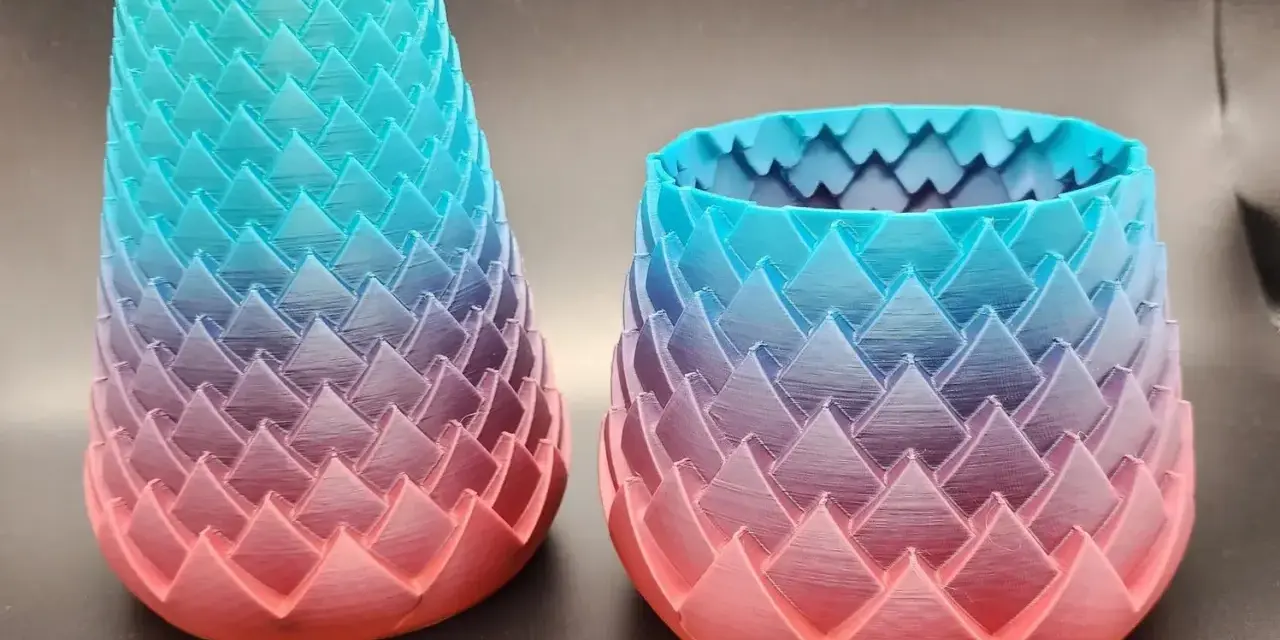
There are three basic ways to get color into a printed part. The first is material jetting, where tiny droplets of photopolymer are deposited and cured layer by layer, allowing the machine to blend pigments and even simulate gradients. The second is multi-filament or multi-material extrusion, where the printer swaps between pre-colored plastics so each region gets its own color. The third is post-processing, which means printing the part first and adding color later with paint, dye, decals, or hydrographic film, a water-transfer process that wraps a printed pattern around the part.
The biggest distinction is this: full-color printing tries to reproduce shades and transitions inside the build itself, while multi-color printing usually creates separate color zones. I think that distinction matters more than brand names, because it tells you whether the part needs realism, branding accuracy, or simply clear visual coding. Once that is clear, the hardware choices become much easier to compare.
The main techniques and where each one wins
| Method | How color is applied | Strengths | Limits | Best fit |
|---|---|---|---|---|
| PolyJet and other material-jetting systems | Jets cured photopolymer in multiple inks or resins, often blending color voxel by voxel, which means the 3D equivalent of a pixel. | Gradients, texture simulation, fine logos, realistic CMF details, and high visual fidelity. | High machine cost, support removal, and parts that are usually less forgiving in rough service. | Packaging mockups, medical models, product visuals, and presentation parts. |
| Multi-filament FDM or tool-changing extrusion | Switches between pre-colored filaments or nozzles so each region gets its own color. | Low entry cost, functional thermoplastics, and clean color blocking for labels or accents. | Purge waste, longer print times, visible layer lines, and no true photographic gradients. | Jigs, fixtures, signage, demo parts, and hobby models. |
| Powder-based contrast or dual-tone systems | Uses powder-bed processes or selective agents to create marked zones rather than broad color blending. | Good throughput, strong parts, and useful contrast for identifiers or surface features. | Limited color gamut and less realism than jetting-based systems. | Production parts, labels, QR codes, and functional components that need visual coding. |
| Post-print coloring | Adds color after printing through paint, dye, or hydrographics. | The cheapest route to multiple colors and the most flexible across printer types. | More labor, more prep, and results that depend heavily on sanding and priming. | Display pieces, custom branding, and low-volume jobs. |
Stratasys’ PolyJet line is the clearest example of true full-color jetting. Its J55 Prime and J850 Prime systems are built for visual realism, and the numbers show why: more than 640,000 distinguishable color combinations on the J55 Prime and over 600,000 Pantone-validated combinations on the J850 Prime, with multiple resins available in a single build. At the other end of the spectrum, some current desktop multi-filament systems support up to 20 colors, but they do that through filament switching, so you pay for convenience with purge waste and longer print times.
That gap between realism and convenience is what makes the next step important: choosing the right method for the actual part, not the one that sounds most impressive on a spec sheet.
How to choose the right method for your part
When I evaluate a project, I start with function. If the part is mainly a visual prototype, I want the sharpest color and surface fidelity I can get. If the part will be handled, bolted down, or used in a shop, I care more about polymer strength, dimensional stability, and color durability. The method should follow that order, not the other way around.
| Use case | Best starting point | Why it fits |
|---|---|---|
| Packaging mockups, product visuals, anatomical models | Full-color jetting | Best at gradients, labels, textures, and realistic CMF, which is short for color, material, and finish. |
| Jigs, fixtures, demo parts, color-coded components | Multi-filament FDM | Affordable, functional, and strong enough for shop use when distinct zones matter more than realism. |
| Large durable parts with simple markings | Powder-based contrast or print-then-color | Better when the part needs to survive first and look branded second. |
| One-off display pieces or legacy hardware | Paint, dye, or hydrographics | Cheapest path to multiple colors without buying special hardware. |
In the US market, the budget gap is still stark. A desktop multicolor setup can start around $400 to $600, while HP’s Jet Fusion 300/500 line was announced starting in the $50,000s. That difference is why I rarely recommend buying industrial color hardware unless the color itself is part of the business case.
The right choice is usually obvious once you decide whether the part is meant to communicate, survive, or ship in volume, and that leads straight into the geometry rules that make color behave on the build plate.
Design rules that keep color changes crisp
- Put color breaks on real edges, panel lines, or raised details instead of across smooth curves.
- Keep fine text and logos larger than the printer can reliably resolve; on FDM, anything near nozzle width gets soft fast.
- Use texture as a design tool. A slight matte or grain finish can make the color separation look cleaner than a glossy surface with the same palette.
- For painted parts, sand and prime before color coats. Primer is what makes paint look intentional rather than like a patch job.
- For parts exposed to sunlight or heat, check pigment and polymer stability, not just the shade on the screen.
- If two plastics need to bond, test them together before committing to production. Different material families do not always behave the same way.
I’ve seen more projects fail because the designer placed a color boundary in the wrong spot than because the printer itself was “bad.” Good geometry makes the process look better than it really is; bad geometry does the opposite. That is why the next question is not just how to print color, but what the hidden costs of each method really are.
The tradeoffs nobody tells you upfront
Purge waste is the first hidden cost on multi-filament printers. Each color swap has to clear old material, so the machine spends time and filament moving from one color to the next. A prime tower, a sacrificial tower used to stabilize flow during material changes, is another reason multicolor jobs take more room than a single-color print. Software optimizations can trim that waste, but they do not erase the fundamental overhead.
Speed is the second cost. A part with a few color islands may be manageable; a logo-heavy model or detailed figurine can trigger dozens or hundreds of swaps. That is why desktop systems that advertise up to 20 colors are impressive, but not necessarily efficient.
Surface quality is the third tradeoff. FDM gives you strong thermoplastic parts, but layer lines and color transitions remain visible. PolyJet gives you the best visual fidelity, but the parts are usually more expensive and less forgiving in rough service. Powder-based color systems can be useful for markings or volume production, yet they are not the same as a photorealistic print.
Cost is where expectations usually break. A current desktop multicolor setup is still accessible, while industrial hardware quickly jumps into the tens of thousands of dollars. That is why I treat color as a workflow decision, not a cosmetic checkbox.
HP’s 2026 Dual Tone option is a good example of that reality. It is aimed at white-and-grey features such as textures, QR codes, markings, and labels, which is useful, but it is not a substitute for broad-spectrum realism. Once you accept those tradeoffs, the final recommendation becomes much simpler: match the method to the part’s purpose, then test one sample before you commit to a batch or a machine purchase.
The setup I would choose first for different projects
- For marketing models, packaging mockups, and presentation parts, I would start with full-color jetting or outsource the first run to a service bureau.
- For jigs, fixtures, enclosures, and functional prototypes, I would choose multi-filament FDM with clear color zones and strong thermoplastics.
- For large production parts that need identifiers, I would use a strong monochrome process and add color through labels, dye, or painted features.
- For hobby models and one-off display pieces, I would prioritize an affordable multicolor desktop printer and keep the geometry simple.
- For teams that only need contrast features like marks, labels, or QR codes, I would watch the newer industrial dual-tone options rather than assuming full-spectrum color is required.