When I choose lettering for cutting or engraving, I think less about style and more about whether the geometry will survive the beam. The right laser fonts are the ones that stay readable after the machine removes material, burns edges, or turns outlines into cut shapes. In practice, that means balancing stroke weight, spacing, counters, and the very different needs of engraving versus cutting.
The shortest path to clean engraved text
- Bold sans-serifs are the safest starting point for most laser work because they stay readable at small sizes.
- Stencil and connected styles help when letters must remain attached after cutting.
- Engraving is usually happier at 8-10 pt on wood or metal, with 12 pt or more needed for thin scripts and hairline serifs.
- Cut text needs room for kerf, bridges, and internal islands like the centers of O, A, P, and R.
- Material matters as much as the font; acrylic, wood, leather, glass, and metal all punish different weaknesses.
- Scrap tests are not optional when the finished part has to look right the first time.
What makes a typeface laser-friendly
I look at four things first: stroke thickness, spacing, counter size, and path complexity. If a font is too delicate, the beam or char zone will erase the details; if it is too tight, the letters merge or close up once kerf and heat are added.
- Stroke weight should be strong enough that the thinnest parts survive the process.
- Counters are the enclosed spaces in letters like A, O, P, and R; if they are tiny, they disappear quickly.
- Spacing needs room for kerning and for the beam itself, especially on small text.
- Geometry should be simple and predictable; ornate flourishes create cleanup work.
For engraved text, I usually start around 8-10 pt on wood or metal and go a bit larger on glass or slate. Thin scripts and hairline serifs are safer at 12 pt or more, because they need enough room to hold their shape after the machine has done its work. That baseline is what separates a font that merely looks good on screen from one that stays legible in production.
Once I know those rules, I stop sorting by brand name and start sorting by behavior. That is where the practical choices become obvious.
Font families I reach for first
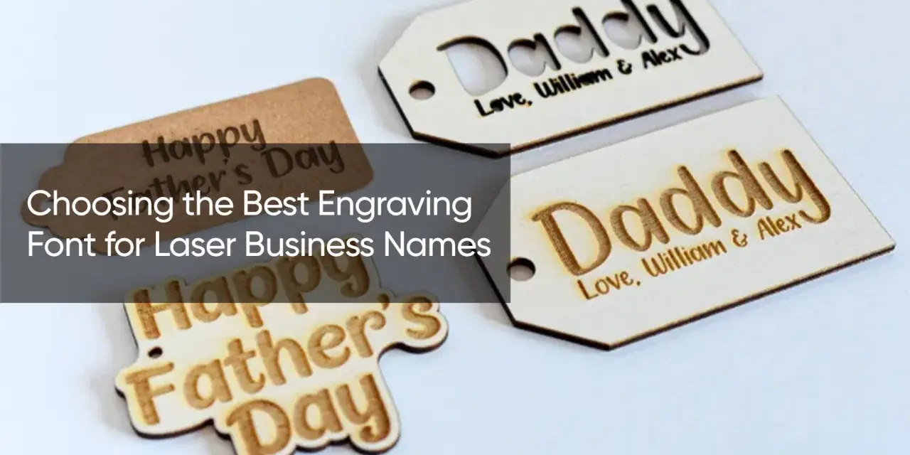
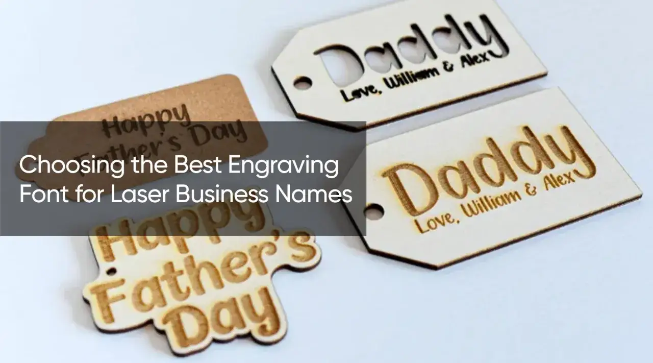
I do not trust style labels alone, but some families are consistently easier to work with. Bold sans-serifs and clean geometric faces usually give the least trouble; stencil and connected styles help when the lettering must remain as a cut part; single-line faces are useful when speed matters more than filled letterforms.
| Font family | Examples | Why it works | Best use |
|---|---|---|---|
| Bold sans-serif | Arial Bold, Helvetica, Franklin Gothic, Verdana | Open shapes, steady stroke weight, and strong readability at small sizes | Labels, plaques, part numbers, branding |
| Geometric sans | Futura, Century Gothic, Avenir Next, DIN | Modern look with simple curves and fewer fragile details | Signs, acrylic logos, retail displays |
| Stencil or connected styles | Stencil faces, welded scripts, bridge-ready layouts | Internal islands stay attached when text is cut out of sheet material | Hanging tags, decor, sheet goods |
| Humanist serif | Georgia, Baskerville, Times New Roman Bold | More formal appearance without becoming unreadable at moderate sizes | Awards, plaques, larger engraved copy |
| Single-line or stick fonts | Hershey-style, SHX-like workflows, engraving-specific single-line fonts | Fast centerline engraving and clean toolpaths for scoring jobs | Technical marking, outline-only engraving, speed work |
A font can belong to the right family and still fail if it is too light or too condensed. I still test the actual file, because the geometry inside a font matters more than the label on the nameplate.
Cutting and engraving ask for different letter shapes
Cutting removes the letter itself, so the real question is whether the remaining material stays stable. Engraving leaves the surface intact, so the main question is whether the mark stays readable after heat, char, or fill passes.
For cut-out letters
If the text is being fully cut from acrylic, plywood, MDF, leather, or paper, I want strong joins and enough spacing for the islands to survive. Letters like O, A, D, P, and R need bridges or a stencil treatment, because their centers would otherwise fall out. Kerf matters here too: it is the width of material the beam removes, and it can quietly turn a nice-looking design into a fragile one.
On plastic parts, I am even more cautious. Melting can shrink a feature faster than expected, so a font that looks fine in a mockup may become too delicate once the edge starts to soften.
Read Also: Tempera Paint for Laser Engraving - The Ultimate Guide
For engraved text
Engraving is more forgiving, but not infinitely forgiving. Raster engraving fills the letter area line by line, while vector engraving follows the outline or a centerline; the first favors simple bold forms, and the second rewards clean paths and consistent stroke width. If I need speed or technical marking, I lean toward a single-line workflow; if I need a polished plaque, I usually keep the type bold and avoid tiny decorative details.
That distinction matters because a font that cuts well is not always the best engraving font, and a beautiful engraving face can be a headache when you try to turn it into a freestanding part.
Material changes the answer more than most people expect
The same font can look crisp on anodized aluminum and mushy on plywood, so I choose by substrate as much as by style. The beam, the surface, and the color contrast all affect whether the text stays clean after processing.
| Material | What usually works | Why |
|---|---|---|
| Acrylic | Bold sans-serif, geometric sans, stencil styles | Edges are crisp, but tiny interior details can melt or chip |
| Wood, plywood, MDF | Bold sans-serif, wider serif faces, stencil styles | Grain and char close up thin spaces very quickly |
| Leather | Simple sans-serif, single-line marking, bold scripts at larger sizes | Heat darkens fast, so thin strokes disappear early |
| Anodized aluminum and coated metal | Clean sans-serifs and vector-friendly text | Contrast comes from surface marking, not deep carving |
| Glass and slate | Larger sans-serifs, sturdy serifs, no hairline details | Frosting effects need more stroke than most people expect |
| Cardboard and paper | Stencil layouts and bold sans-serifs | Fragile edges and burn-through punish delicate forms |
For fabrication projects in plastics, I usually err toward thicker stems and wider spacing. It is easier to trim a bold design down than to rescue one that vanished into the material.
My preflight checklist before I send text to the machine
Most bad results come from skipping one boring step, not from the font itself. My checklist is short, but I follow it every time because it saves material.
- Convert live text to outlines and make sure the laser software reads the paths the way I expect.
- Decide whether the job needs filled text, outline text, or true centerline engraving before I edit anything.
- Check kerning and tracking. Kerning is the pair-by-pair spacing; tracking is the overall spacing across the word.
- Open the spacing slightly on small text. I often add 5-10% tracking rather than letting letters crowd together.
- Add bridges if the letters need to stay attached after cutting.
- Run a scrap test at full size before I commit to the finished material.
If the text is a logo or a product name, I also zoom in and inspect every intersection, especially in scripts and condensed faces. A tiny overlap on screen can become a burned blob once the machine starts moving.
Fonts I avoid unless the design is large and decorative
Some styles look attractive in a mockup and then collapse under production reality. I usually avoid them for small work, or I reserve them for oversized signs where the machine has room to breathe.
- Hairline serifs break first, especially on wood and acrylic.
- Ultra-condensed display faces crowd the counters and make kerning unforgiving.
- Thin scripts lose their joins or turn into a tangled cut path.
- Novelty and ornamental fonts create path complexity without improving readability.
- Fancy monoline outlines can look precise on a screen but print weakly once kerf and heat are added.
My rule is simple: if the type needs a lot of visual explanation before it makes sense, it probably is not a strong candidate for fabrication. That does not mean decorative text is off limits; it just means the size, material, and machine settings have to work harder to protect it.
What I would choose for common laser projects
When I am working fast, I match the font to the job rather than browsing endlessly. These are the pairings I would start with.
| Project | Good starting choice | Why I would start there |
|---|---|---|
| Small product label | Bold sans-serif or single-line engraving font | Legibility matters more than personality |
| Award plaque | Humanist serif or polished sans-serif | Looks premium at larger sizes without becoming fragile |
| Cut acrylic logo | Bold sans-serif or stencil layout | Keeps islands attached and reduces cleanup |
| Wood sign | Geometric sans-serif or bold serif | Good contrast and stable edges |
| Technical marking | Single-line or compact sans-serif | Fast, readable, and easy to reproduce |
| Personalized gift | Bold script only if large enough; otherwise a clean sans-serif | Scripts need room to stay elegant instead of messy |
If I only get one chance to prove a layout, I start with a bold sans-serif, then adjust spacing for the material and the machine. That choice is not flashy, but it is dependable across acrylic, wood, metal marking, and most engraved labels.
The safest starting point when the first pass has to work
The bigger lesson is that typography for lasers is really a fabrication decision: the font, the kerf, the substrate, and the viewing distance all have to agree. When they do, the result looks intentional instead of merely surviving the process.
If you want the shortest practical answer, choose a simple bold face, give the text a little room, and test it on scrap before you cut the finished piece. That is the habit that saves the most time, material, and frustration.