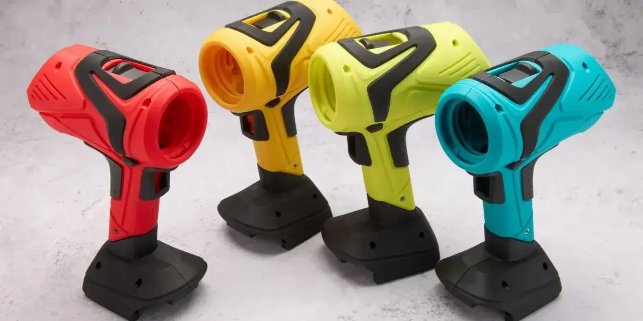
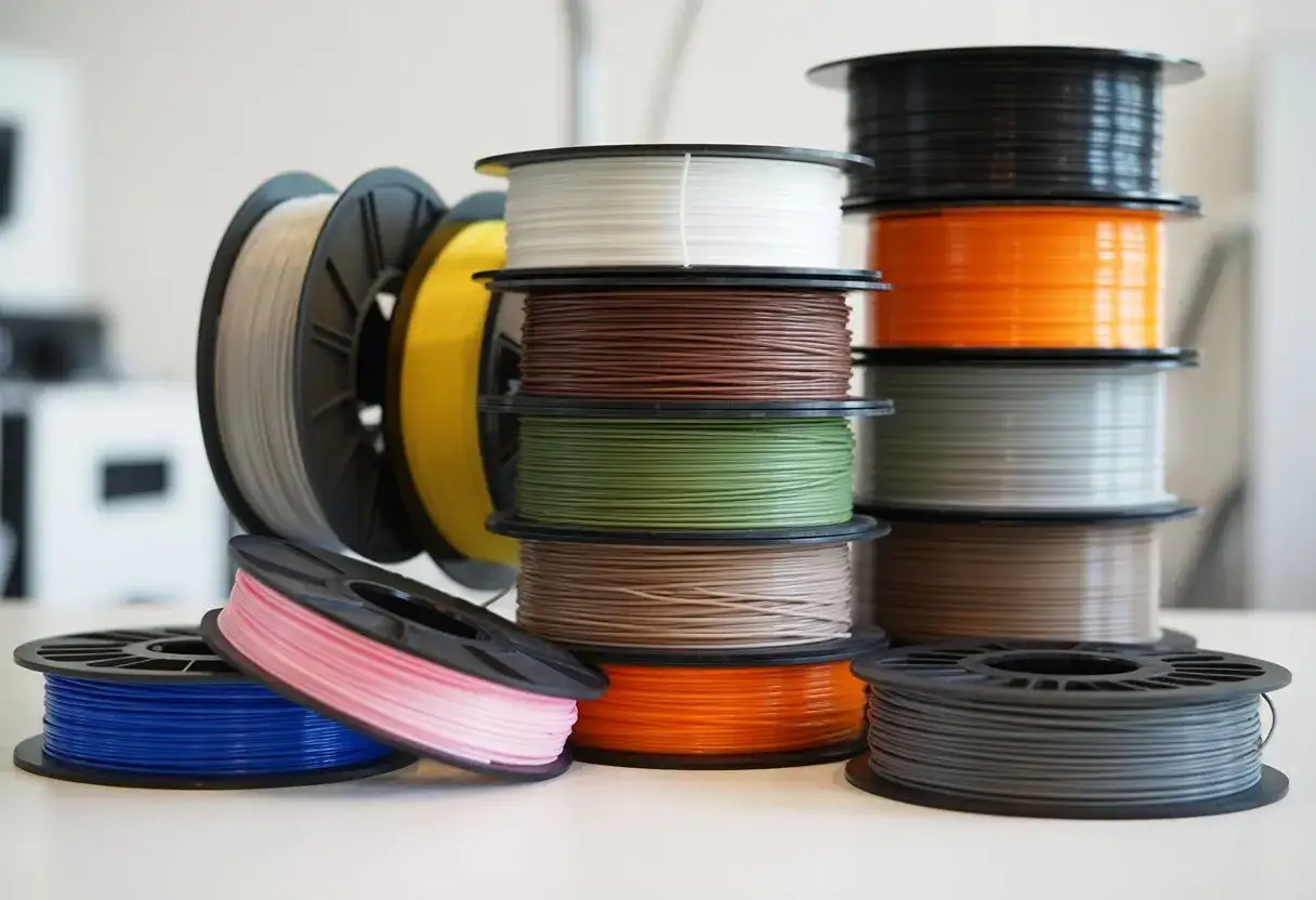
Color is one of the fastest ways to change how a printed part feels. A black technical bracket, a translucent PETG cover, and a matte pastel prototype can all come from the same printer, but they solve very different problems. In this article I break down which filament families give you the broadest color range, which finishes are actually worth paying attention to, and how to pick a shade that fits the part instead of fighting it.
The main choice is material, finish, and use case
- PLA usually gives the widest everyday palette and the most decorative finishes.
- PETG is strong on functional colors and clear or translucent looks.
- ABS, ASA, TPU, nylon, and composites usually have narrower palettes than PLA.
- Matte, silk, metallic, glow, transparent, and gradient finishes can matter more than the color name itself.
- The same named color can look different across brands, materials, lighting, and print settings.
Which filament materials give you the widest color range
If I had to answer the color question in one sentence, I would say this: PLA is still the broadest starting point for color choice, PETG comes next, and the more technical materials usually narrow the palette. That does not mean the narrow materials are poor choices. It only means the market tends to prioritize performance over novelty once you move away from hobby-friendly PLA.
Hatchbox is a good example of how that spread usually looks in practice: it currently lists 42 PLA options, compared with 14 PETG entries, 10 ABS, and 16 TPU. That is not a universal rule, but it is a very useful proxy for how the catalog usually shrinks as the material gets more specialized.
| Material | Typical color availability | Best visual use | Main tradeoff |
|---|---|---|---|
| PLA and PLA blends | Widest range, from black, white, gray, and natural to neon, pastel, silk, matte, metallic, and rainbow effects | Cosmetic parts, prototypes, display models, and consumer-facing prints | Heat resistance is modest, so it is not the best choice for hot environments |
| PETG | Broad range, with a strong showing in clear, translucent, and saturated solid colors | Functional parts that still need a clean visual finish | Fewer novelty finishes than PLA, and the shine can vary by brand |
| ABS and ASA | Usually a tighter set of neutrals, primaries, and technical colors | Housings, enclosures, and parts that need a more industrial look | Color catalogs are usually smaller, and the material brings more printing constraints |
| TPU and other flexibles | Useful but narrower palette, often black, white, red, blue, and a few bright shades | Grips, seals, wearables, and soft components | Fewer decorative choices and less consistency across brands |
| Nylon and PA blends | Often natural, black, white, and a smaller number of dyed options | Strong functional parts where performance matters more than decoration | Moisture sensitivity and a more limited color wall |
| Fiber-filled and engineering composites | Usually dark or neutral, with occasional subtle effect shades | Technical parts with a premium, machined look | Color is secondary to stiffness, wear, or heat behavior |
Brands that care about repeatability sometimes go further and tie colors to standards instead of loose marketing names. That matters when a part has to match a product line, a housing, or a client’s existing visual system. Once you understand that basic material split, the next question is what the surface finish does to the look.
The finishes that change the look more than the hue
I separate color from finish because finish is what most people react to first once the print is in their hand. A matte red and a silk red can look like two different products, even when the pigment is similar. The hue matters, but the surface response to light often decides whether a print feels technical, premium, playful, or cheap.
- Matte reduces shine and hides layer lines better, which makes it a strong choice for prototypes and enclosure parts.
- Silk creates a reflective, almost painted look that works well on display pieces, but it can soften very fine detail.
- Metallic and sparkle add depth and help disguise small surface flaws, especially on curved surfaces.
- Translucent and clear are less about the exact color name and more about how light travels through the part.
- Glow-in-the-dark is visually useful for markers and hobby parts, but the additive can make the filament more abrasive.
- Gradient and rainbow filaments are a visual effect, not a color-matching tool, so I use them when variation is the point.
That is why two spools with the same nominal color can still produce very different results. The finish can be the quiet detail that makes the whole print work, which leads directly to the next issue: why the same shade behaves differently from one setup to another.
Why the same color name can look different on the printer
Color is not fixed at the spool. Pigment load, resin base, wall thickness, infill, and lighting all change the result. I have seen the same named blue read deep and saturated on one brand, flatter on another, and almost gray when the walls were thin or the part was backlit.
| What changes the look | What it usually does | Why it matters |
|---|---|---|
| Brand formulation | Changes pigment density and the base resin color | The label is only a rough promise, not a universal standard |
| Material family | Shifts the optical feel even when the name matches | A red PLA and a red PETG rarely read the same way |
| Wall thickness | Makes colors look deeper or more translucent | Thin walls often look lighter and less saturated |
| Infill pattern | Can show through translucent parts | Crossing lines or dense patterns may become visible in the shell |
| Lighting | Changes the perceived shade and gloss | Office light, daylight, and retail lighting can make the same part look unrelated |
When appearance matters, I print a small sample first and check it in the same light where the final part will live. That habit saves more reprints than any catalog photo, and it naturally leads to choosing color by use case instead of by the spool alone.
How I choose a filament color for real use cases
The cleanest way to choose is to start with the job. Once I do that, the color decision gets much easier, because each use case has a visual logic of its own.
- Functional brackets, jigs, and mounts usually work best in black, gray, or natural because those colors hide wear and keep the part visually calm.
- Client prototypes often benefit from matte neutrals or brand-matched shades, because the goal is to communicate shape rather than distract with color.
- Safety or visibility parts should be high-contrast, so orange, yellow, or neon green make more sense than a tasteful dark tone.
- Display pieces can justify silk, metallic, or stronger saturated colors because the part is meant to be seen, not just used.
- Light covers, diffusers, and lenses need translucent or clear filaments, but only when the geometry supports that effect.
- Multi-part assemblies benefit from distinct colors because assembly, maintenance, and troubleshooting all become easier.
If a part has to match an existing product line, I prefer filaments that reference RAL or similar color standards instead of loose marketing names. Fillamentum is a good example of that mindset: standardized naming helps when the shade has to be repeatable, not just visually close. Once the job itself defines the color, the last step is making the ordering process reliable.
Practical rules that prevent color mistakes
I treat filament color like a specification, not a guess. That means I keep a few rules in place every time I order.
- Choose the material first, then the color. A great-looking shade is not useful if the material cannot handle the part.
- Buy a sample spool or swatch before committing to a production run.
- Match color in the same material family whenever possible, because the same name can shift across PLA, PETG, ABS, and TPU.
- Check color under daylight as well as indoor light.
- Save the brand, lot, nozzle, layer height, and infill settings for any part you may need to reorder later.
- Be careful with abrasive specialty filaments. Glow, carbon-fiber, and glass-filled blends can justify a hardened nozzle.
Those habits turn color selection from a subjective decision into a repeatable process. That is the real win, because the best filament color is the one you can print again six months later and still trust.
A compact palette that covers most projects
If I were building a lean filament inventory for a shop or design studio, I would start with black, white, gray, natural, one high-visibility color, and one effect spool such as translucent, metallic, or matte. That small set covers most functional parts, client reviews, and presentation models without turning the shelf into dead inventory.From there, I would add brand-matched shades only when the work really calls for them. That is the point where color stops being decoration and becomes part of the design spec, which is exactly how I like to handle filament choices in practice.